Send It Board Game

The idea for SEND IT! began with a crash — a bad one. That crash sparked a lot of reflection about what went wrong, which eventually paired with a love of board games to inspire the concept: a mountain-biking board game that captures the fun and challenges of hitting the trails.

Methods
Graphic Designer & Illustration
Client
Sent It Board Games, LLC.
Duration
11 months
Tools
Illustrator, Photoshop

Translating the prototype

Syd and Macky reached out to me to create the illustrations and visual system for the game. They had already been working on a prototype and sent me a playable version so I could understand the game mechanics firsthand.

My work focused on creating a visual language that communicated gameplay meaning quickly and intuitively. Color, shape, icons, and hierarchy were essential in helping players recognize skill levels and actions at a glance.

Color and shape are key to quick understanding of play.

For example, we used trail signage shapes and colors to suggest difficulty: a green circle for beginner trails and other shapes/colors for more advanced elements. This consistent visual system helped players immediately understand what each component meant without needing to reference a rulebook.

Send it Tiles: Shape and color Language is Key

Each icon was designed to reflect a specific skill or game action. Colors were chosen to be both meaningful (aligned with common visual cues) and visually engaging. Repeating the icons and colors throughout the tiles developed a cohesive “gameplay language” that made the experience more intuitive.

We considered a more decorative tile design but ultimately opted for a simpler, bolder approach that better supported clarity and quick recognition during play.

Version 2.0

After the initial mountain biking edition launched successfully, the developers asked me to create assets for a ski-themed version of the game.

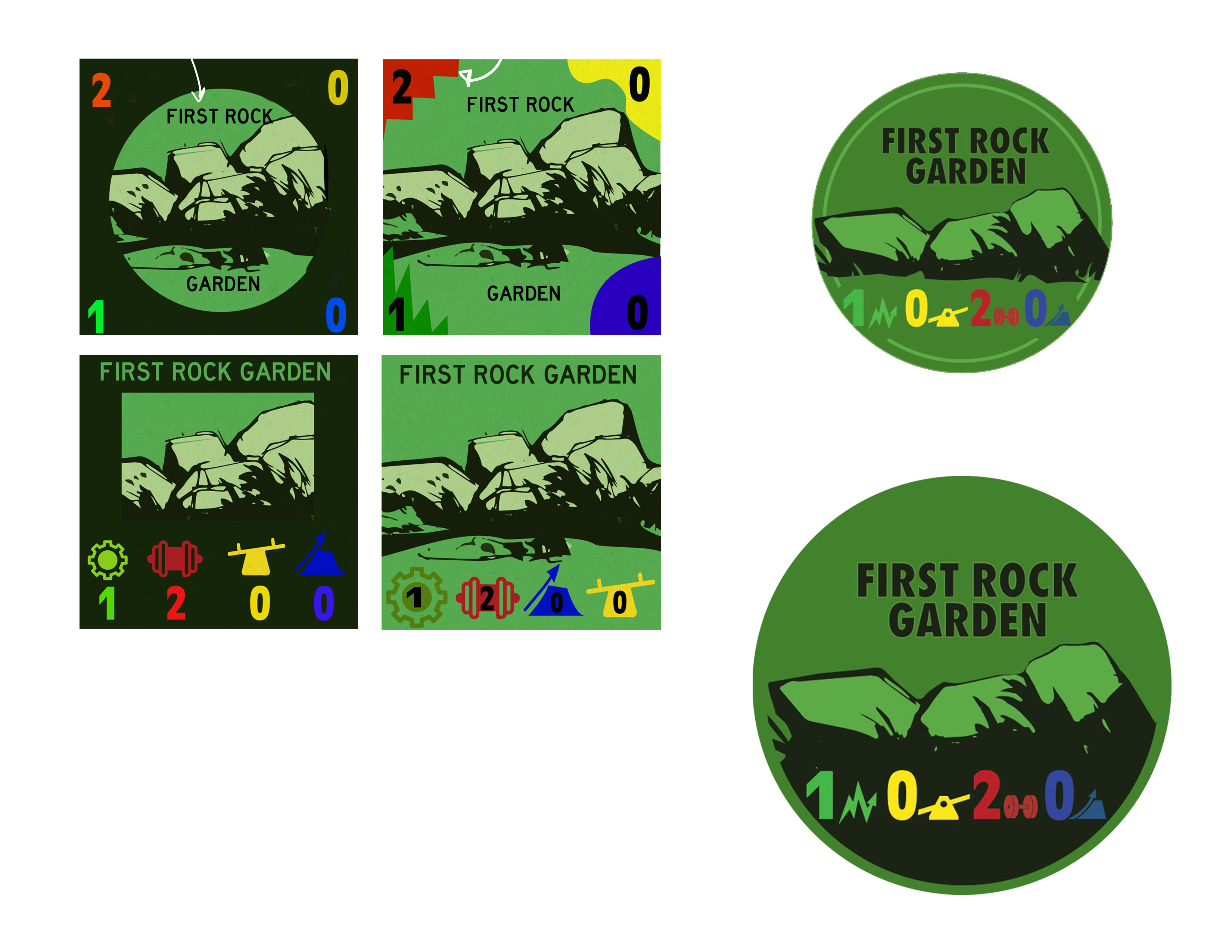
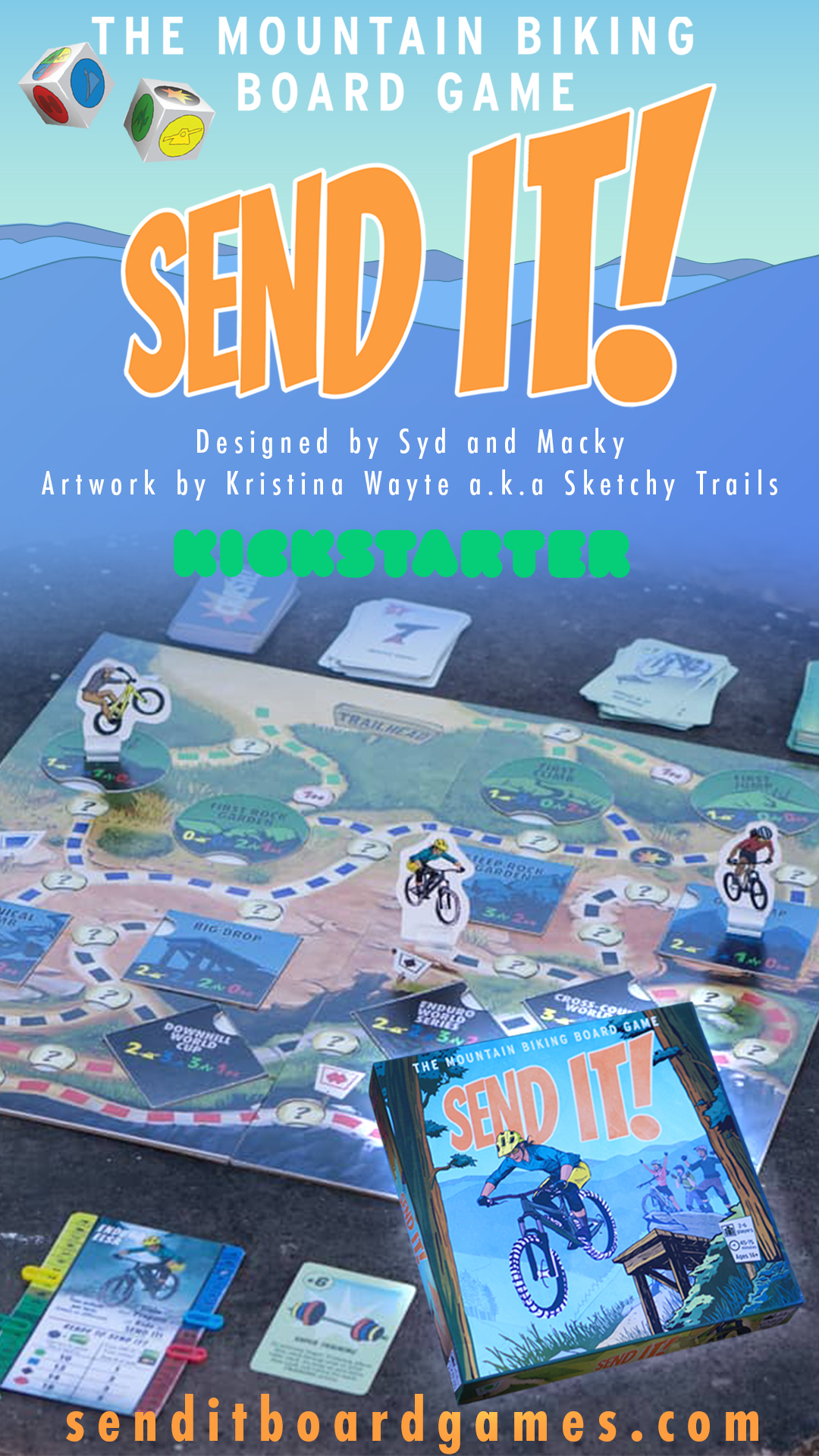
Applying feedback from the Bike game into the Snow Game.

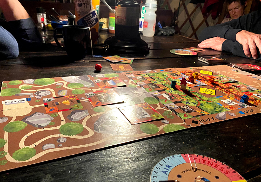
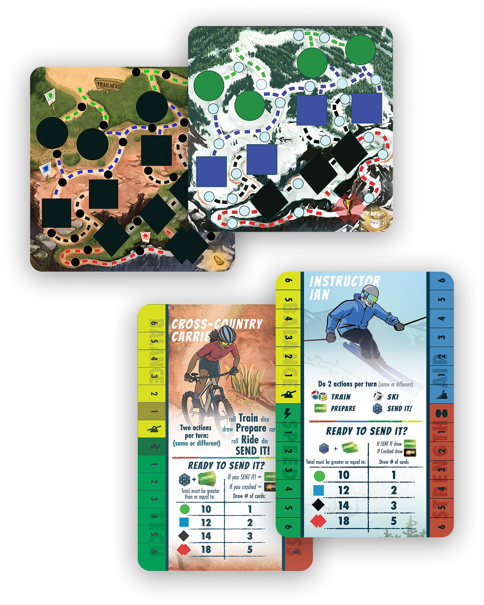
The original 4-fold board caused issues during printing, which I was unable to catch before release.

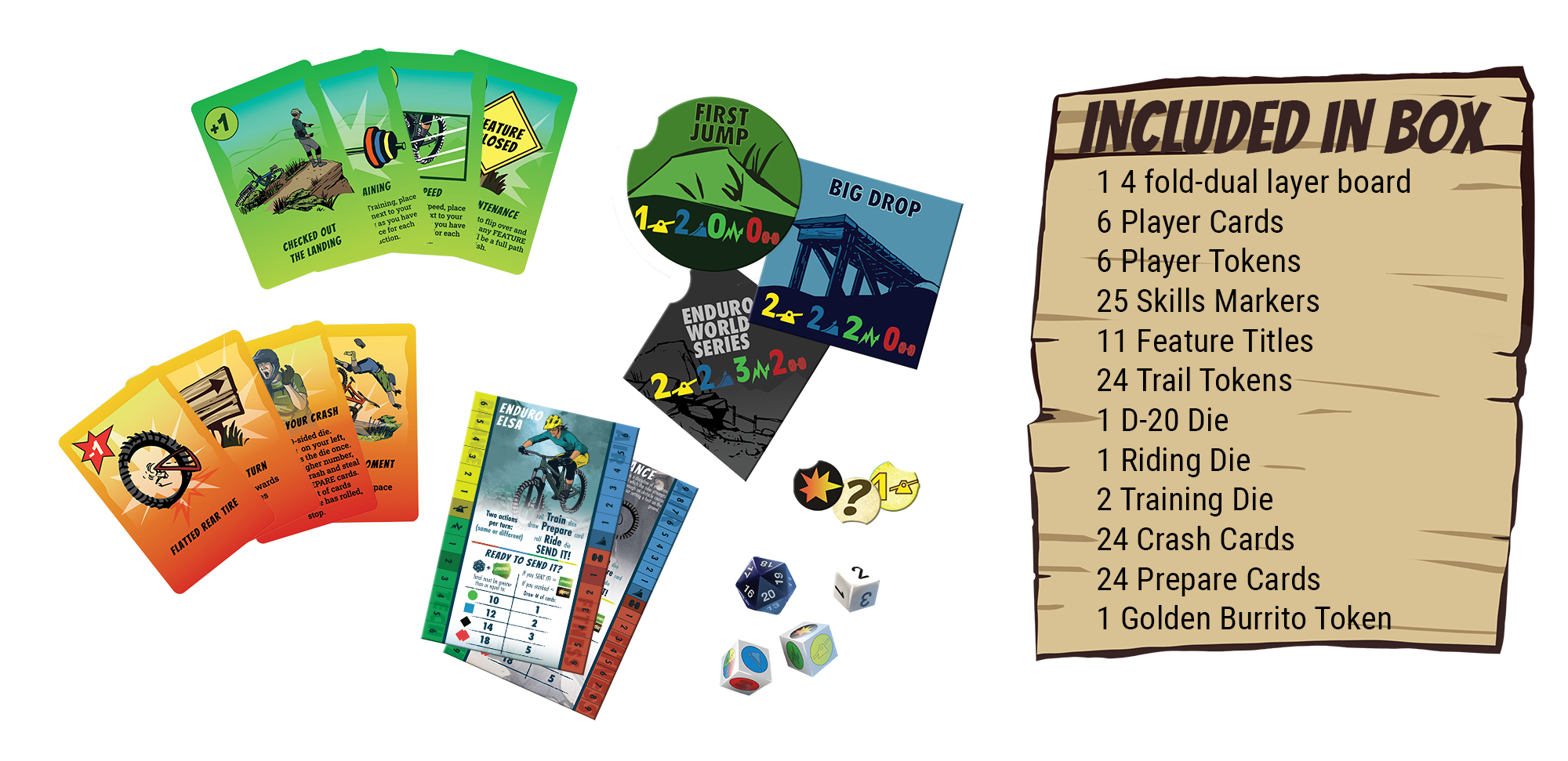
Players found some player cards too cluttered, so I simplified the wording and increased spacing for better readability.

Some players struggled to see where to move their game pieces, so the path was more clearly defined in the second edition.

The “Actions” section was often overlooked, so I added a solid white background to improve visibility.

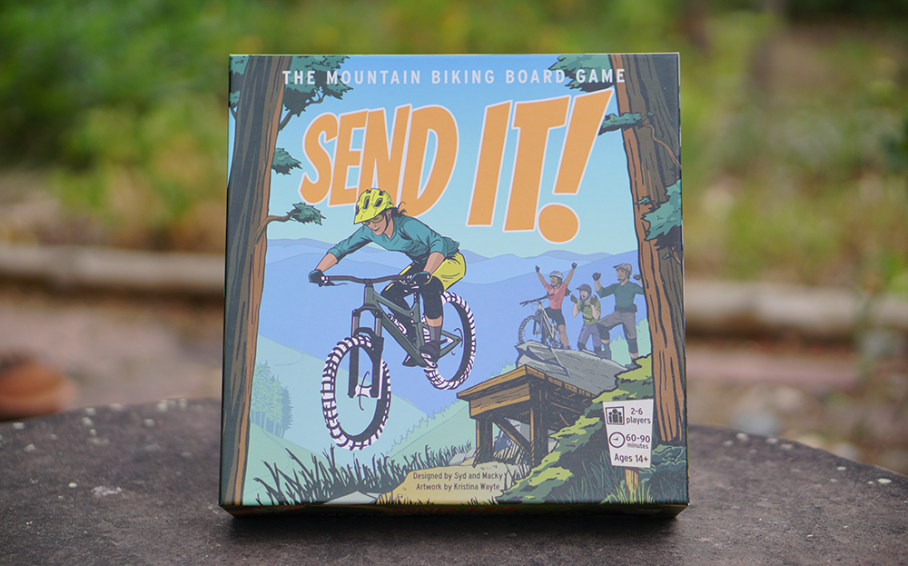
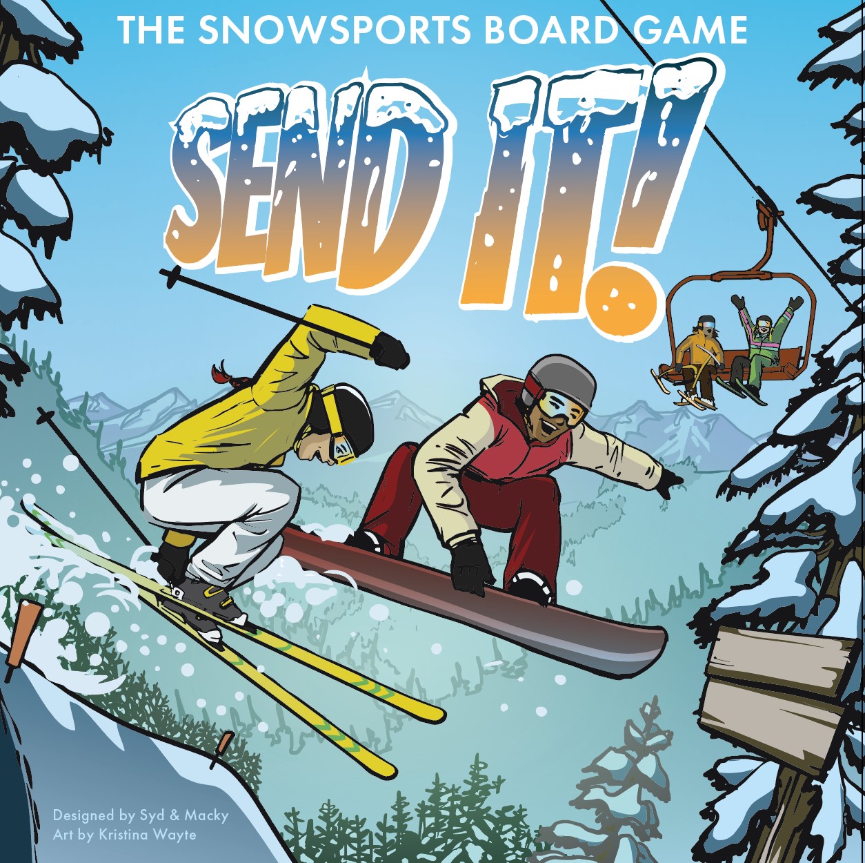
Players reported that the art enhanced their play experience, adding to the fun and immersion of the game.

Conclusion

The first game was successfully funded by 546 backers, raising $50,677, with continued sales after launch.
The success of the mountain biking edition led directly to a second, ski-themed version, incorporating valuable player feedback to improve playability and clarity.